When we talk about web accessibility, we usually think about color contrast, captions, or keyboard navigation. But there is an equally important—and often overlooked—aspect: interactive target size, or what the Web Content Accessibility Guidelines (WCAG) refer to as Target Size.
This criterion refers to the minimum size that interactive elements must have (buttons, links, icons, touch controls) so that everyone—including people with motor or visual impairments—can use them without difficulty.
What is Target Size?
Target Size defines how large the clickable or tappable surface of an interactive element should be.
A target that is too small can lead to interaction errors, especially for:
- People with tremors or motor impairments.
- Touchscreen users (mobile phones, tablets, etc.).
- People with low vision or who use screen magnification.
Therefore, an appropriate target size improves usability for everyone, not just for people who rely on assistive technologies.
WCAG 2.2: Success Criterion 2.5.8: Target Size (Minimum) (Level AA)
In WCAG 2.2, Success Criterion 2.5.8 Target Size (Minimum) states the following:
Targets must be at least 24 × 24 CSS pixels in size, except when:
- The target is within a sentence or block of text (for example, links inside a paragraph).
- There is an alternative way to perform the same function.
- The target size is determined by the user agent (such as browser controls).
- There is sufficient spacing between targets to prevent accidental activation.
In other words, every button or link must have a minimum interactive area of 24×24 pixels, either through its own size or via sufficient surrounding space.
Note: the exception for inline text links only applies if the text is readable and the links are easy to distinguish and select.
Example 1: small icons with expanded clickable area
A 16×16 px “close” icon may seem too small, but it can still meet the guideline if its clickable area is expanded to 24×24 px using padding or an invisible container.
.close-btn {
  width: 16px;
  height: 16px;
  padding: 4px;
}
✅ Meets the AA criterion, even though the icon remains visually small.
Example 2: text links that are too close together
Visit our <a href="#">blog</a>, <a href="#">foro</a> y <a href="#">support</a>.
On touchscreens, these closely spaced links can cause errors when tapped.
Solution: add spacing or convert them into buttons with a larger touch area.
  <a class="link-btn" href="#">Blog</a>
  <a class="link-btn" href="#">Forum</a>
  <a class="link-btn" href="#">Support</a>
.link-btn {
  display: inline-block;
  padding: 6px 10px;
  margin-right: 8px;
  border-radius: 6px;
}
This reduces touch errors and improves the experience on mobile devices.
WCAG 2.2: Success Criterion 2.5.5: Target Size (Level AAA)
At the AAA level, the standard is more demanding: targets must be at least 44 × 44 CSS pixels.
This criterion has existed since WCAG 2.1 and remains unchanged in WCAG 2.2. It ensures a more comfortable and error-tolerant interaction, especially valuable in touch-based interfaces or public-facing products (banking, healthcare, public administration, etc.).
Example 3: form buttons
Many forms feature buttons that are too small or placed too close together. A 32×18 px submit button can be difficult to press accurately.
✅ A good practice would be to design it like this:
button {
  min-width: 44px;
  min-height: 44px;
  padding: 8px 12px;
  border-radius: 8px;
}
This meets Level AAA and also improves both aesthetics and overall usability.
Best practices to meet this criterion
- Increase the clickable area: use padding instead of enlarging only the icon.
- Leave space between interactive elements: while WCAG does not define an exact measure, a minimum spacing of 8 pixels is usually effective.
- Avoid grouping links or icons too closely together, especially in mobile menus.
- Test with real users or touch simulations: what works with a mouse may fail when using a finger.
- Use relative units (em, rem) to preserve scalability when zooming.
- Verify across different devices: visual size varies between high-density (retina) displays and standard screens.
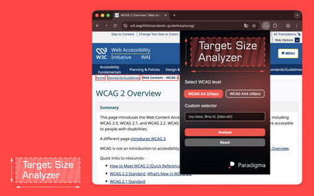
Tip: tools such as Axe DevTools, Lighthouse, or Accessibility Insights allow you to visualize and measure clickable areas directly in the browser. In addition, I’ve created a Chrome/Firefox extension for this post, which I describe below.
Target Size Analyzer
Due to a need that arose in an accessibility-related project I’ve been working on, I needed a way to quickly and clearly highlight on screen the elements that did not meet these criteria, so I built a browser extension to do just that:

With this extension installed, all you have to do is run it on the page you want to analyze and click “Analyze.” You can choose between AA or AAA levels and even select specific elements or attributes.
You can find this app for Chrome and Firefox at the links below. If you’re curious about how to build browser extensions yourself, I invite you to read this post on how to create your own browser extensions.
- Target Size Analyzer on the Chrome Web Store
- Target Size Analyzer on Firefox Add-ons
- Source code on GitHub
Benefits beyond accessibility
Meeting the target size criterion doesn’t just help people with disabilities:
- Improves the mobile experience and reduces touch errors.
- Increases conversion rates by making interactions easier.
- Reduces frustration across all ages and ability levels.
- Adds visual consistency and clear hierarchy to interactive elements.
In short: what is more accessible is also more usable.
Conclusion
Target size may seem like a minor detail, but it is key to achieving inclusive, comfortable, and error-free interactions. Adopting Criterion 2.5.8 (AA)—or even better, 2.5.5 (AAA)—ensures an interface that respects the diversity of users and usage contexts.
Accessibility doesn’t limit design; it makes it more human.
Comments are moderated and will only be visible if they add to the discussion in a constructive way. If you disagree with a point, please, be polite.


Tell us what you think.