Welcome to this short guide to help make your apps accessible. A few months ago, we shared the upcoming changes related to accessibility. Since it's such a broad topic, we’ve divided this guide into two parts. The first (this one) covers general advice, and the second will focus more on coding practices.
Don't worry—we’ll take it step by step. 😉
Accessibility is a hot topic. According to the WHO, around 285 million people globally have some form of visual impairment, and 15% to 20% of the population are neurodivergent, including those with ADHD, autism, dyslexia, etc. That means not everyone perceives color, sound, or shape the same way, and it’s our duty to ensure everyone has access to the same content—just as we work to support various devices and operating systems.
In short, this should always be a part of app and web development. Everyone—regardless of disability—deserves access to our digital products. Sadly, this hasn’t always been taken seriously, but that’s about to change.
The new Spanish Law 11/2023, based on the EU directive 2019/882, and Royal Decrees 1112/2018 and 193/2018, are already in force for public sector apps and websites as of 2025, and will be mandatory for private company apps by 2029.
What happens if I don’t make my app or website accessible?
Failing to comply with these laws may result in fines ranging from €301 to €1 million, and even a ban from operating in the European market. There’s also the reputational damage to consider. In some severe cases, public funding could be suspended.
Feeling lost? Not sure how to make your app accessible? Here are a few tips.
First of all—don’t panic. Making an app truly accessible (especially one already in production) isn’t easy. It takes time, dedication, testing, and iteration.
It means aligning visual elements, supporting screen readers, and designing for users with visual, hearing, learning, or cognitive impairments. It's not a quick fix with two Jira tickets—it may involve collaboration between design, backend, and business teams. That said… let’s get to it!
Get familiar with accessibility gestures
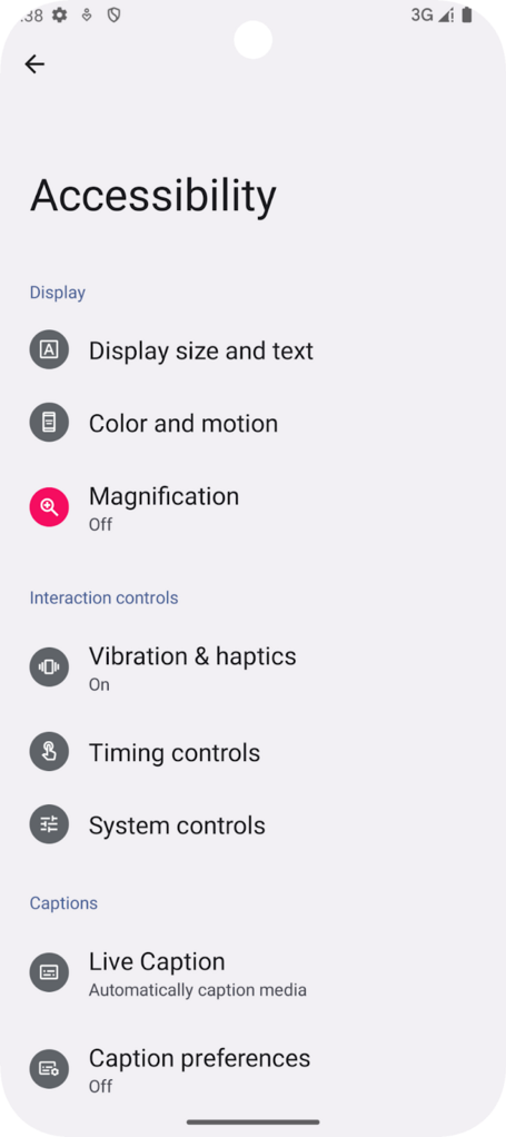
When enabling accessibility features, you’ll find options like haptic feedback, color contrast adjustments, text size scaling, physical button controls for navigation, and on-screen audio descriptions.

If your device doesn’t support these features by default, you can install Google TalkBack from the Play Store. This enables gesture navigation and voice feedback for users with low vision.

TalkBack changes navigation: swipe left/right to move focus between elements, and double tap to activate. Multi-touch gestures, like a three-finger tap, open the TalkBack menu.

We recommend checking out Google TalkBack’s gesture guide for a full overview.
Size and color matter too
According to Material Design guidelines, interactive elements should be at least 48 x 48 dp, with 8 dp spacing between elements. You can enforce this with Modifier.minimumInteractiveComponentSize(). Padding also helps enlarge tap areas.

Text must also meet contrast requirements: 4.5:1 for normal text, 3:1 for large text. Refer to the W3C text contrast guidelines for compliance.
Don’t rely solely on color—use meaningful icons
Color helps convey meaning—green for success, red for error. But what if the user is colorblind?
Use icons (e.g., X for cancel, V for accept) to reinforce meaning regardless of color.

Check your UI—users may use larger font sizes
Most testing is done with default device settings, but many users increase system font size. When that happens, your UI can break—overlapping elements, unreadable text, broken layouts.
Always use sp units for text sizes (not dp or px), since system font settings scale only sp.

Test on devices or emulators with varying font sizes to prevent issues before going live.
Orientation? Don’t lock it to portrait—play fair!
Android 16 brings important updates. Remember locking your app in portrait mode?
"My app is for vertical use only, so I’ll just set it to portrait." Sound familiar?
Android 16 restricts that for accessibility. Some users need to operate their devices in landscape mode. Your app must support both orientations to avoid excluding them.
<application
   android:name=".CustomApplication"
   android:screenOrientation="sensorPortrait"
Conclusions
As you’ve seen, some of these tips are simple to implement and others a bit more complex, but there’s always a way to make your app more accessible. As we mentioned at the beginning, in many cases you’ll need to involve other teams beyond development—like design or business—so some of these tips may take more time. All these steps will help you create a more inclusive app, adapted for everyone, regardless of the superpowers we may or may not have.
Accessibility has become a legal—not just moral—obligation, and the deadline for compliance is approaching fast. Remember that failing to comply can lead to legal consequences.
In the next post, we’ll help you implement accessibility in your code, so get ready—the accessibility race is just beginning.
We’re already prepared. Are you?
References
Comments are moderated and will only be visible if they add to the discussion in a constructive way. If you disagree with a point, please, be polite.


Tell us what you think.